#005 - Painted Hills
In v0.1.3, I transitioned the landscape rendering system from the temporary low-poly-esque look to something a little more permanent. I mentioned briefly in devlog #3 that I was shooting for a watercolor-esque art style for this game, so let's discuss what exactly that means.
Three key features of watercolor art stand out to me the most:
- The colors are blurry, soft, and tend to bleed together, having an overall "cloudy" texture.
- Despite this, there are still hard edges between different objects present in the art.
- Shading is minimal, with the only gradients being broad and undetailed, or a product of the color blending produced by the medium.
With this in mind, the rewrite began.
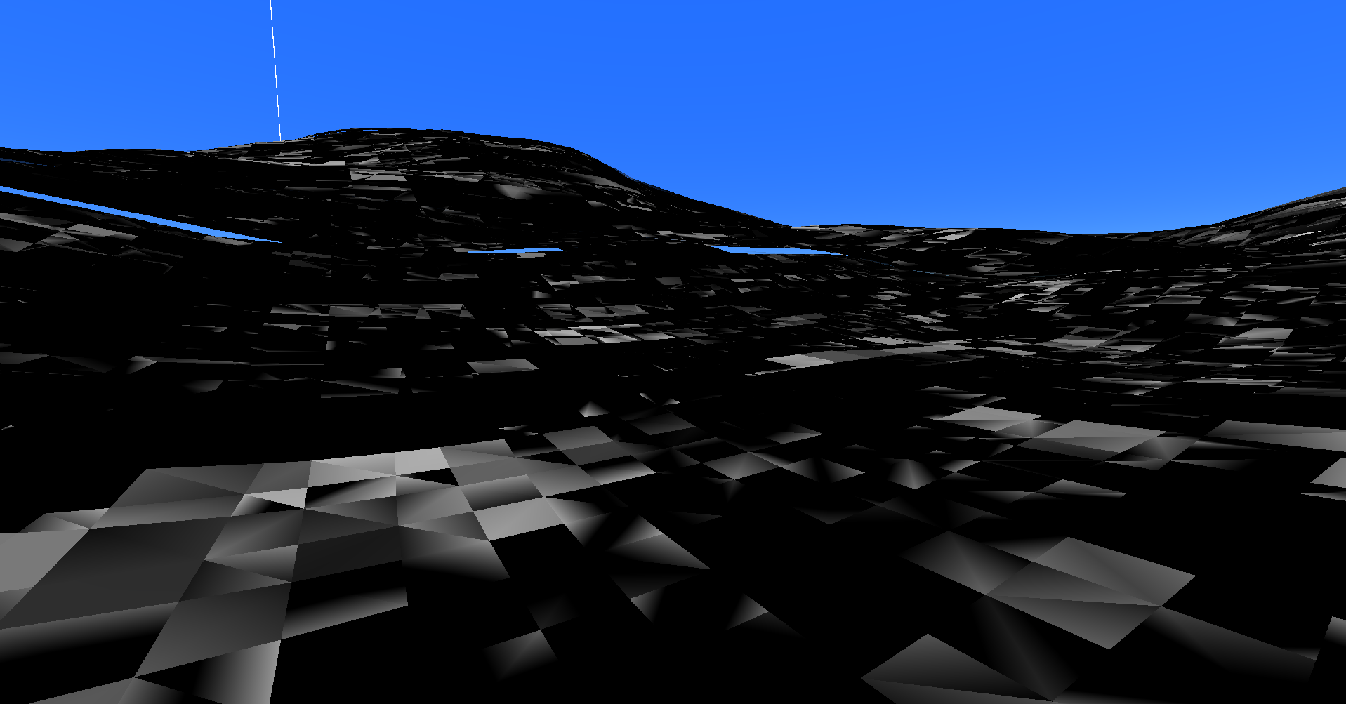
The first step was to redo the coloring. The stripe-looking system from before was fine, and it gave the player a good sense of scale, but it was never meant to be permanent. After quite a bit of failure (pictured above), I got a smooth gradient working on the ground.
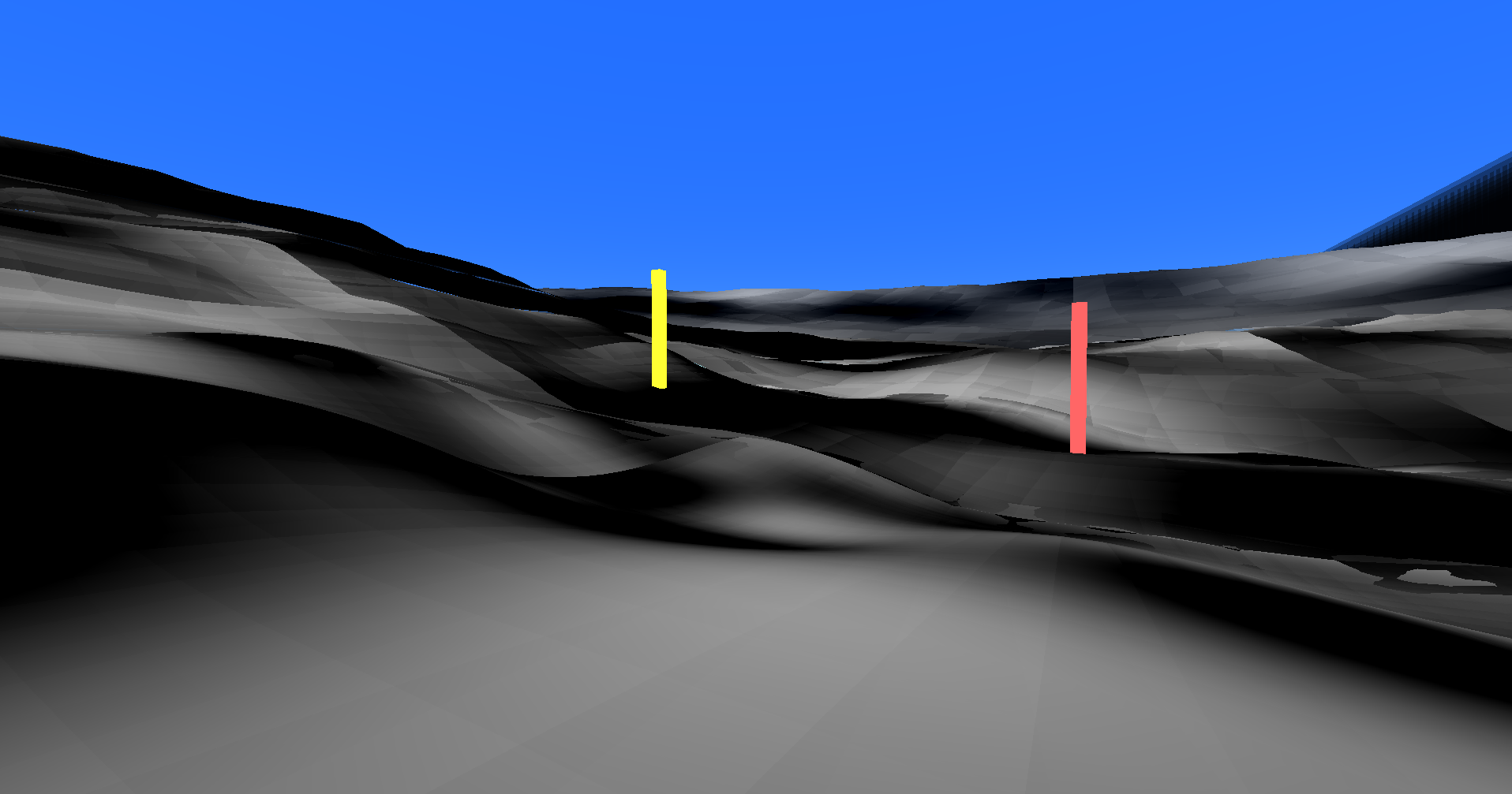
After fixing those nasty border-seams that you can see here, I played around with the actual colors being used to represent grass. It took a lot of tweaking and layering different gradients together, but I eventually landed on something I found satisfactory.
The problem I'd often end up encountering were the colors feeling too "rich" and saturated for both the actual subject matter and the artstyle, and I'd often overcorrect for this by turning the saturation way down and getting a result not too dissimilar from the one above. In the end, I think the balance of colors currently in the game are good for now.
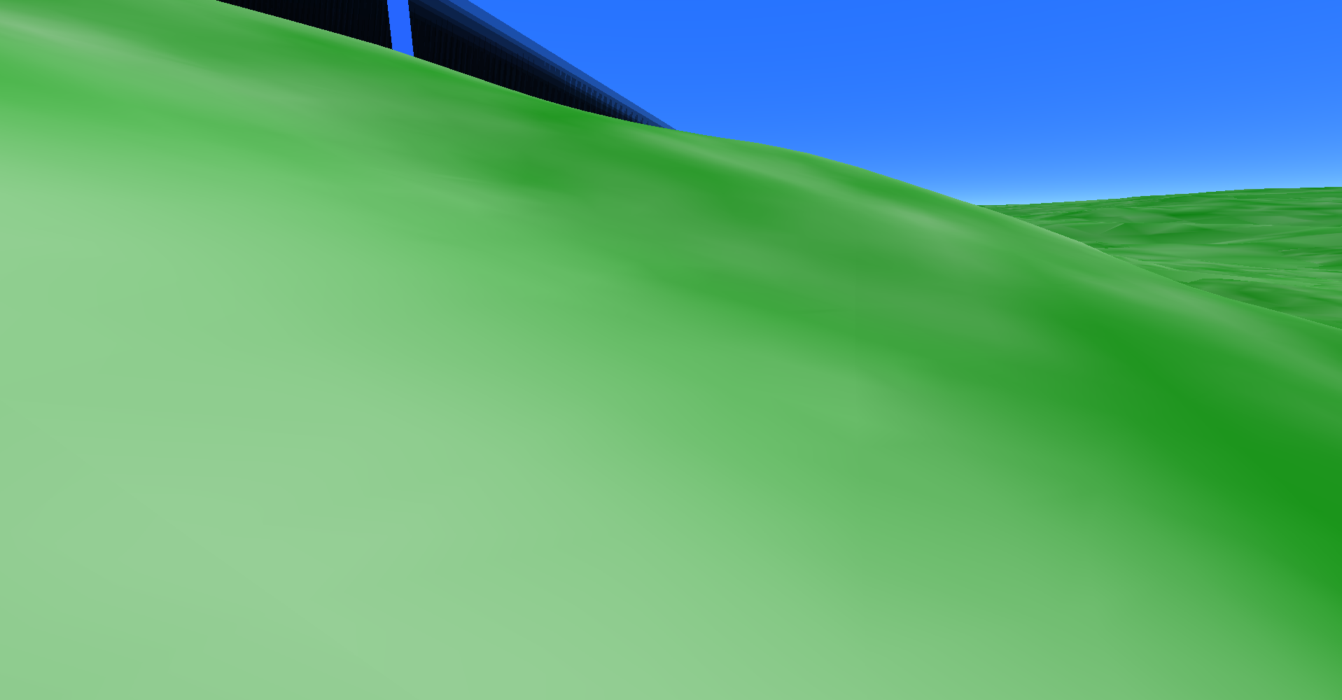
This screenshot actually has smooth lighting on the grass, as disabling it would've been too much of a pain in the ass for this devlog.
But this is still very incomplete. The grass has the proper colors, but everything looks like an amorphous blob.
The first order of business was to reimplement lighting, although, rather than using face-based normals for directional lighting, I instead had normals generate in a point-based manner instead, which gets rid of the hard-edge approach from before and smooths everything out.
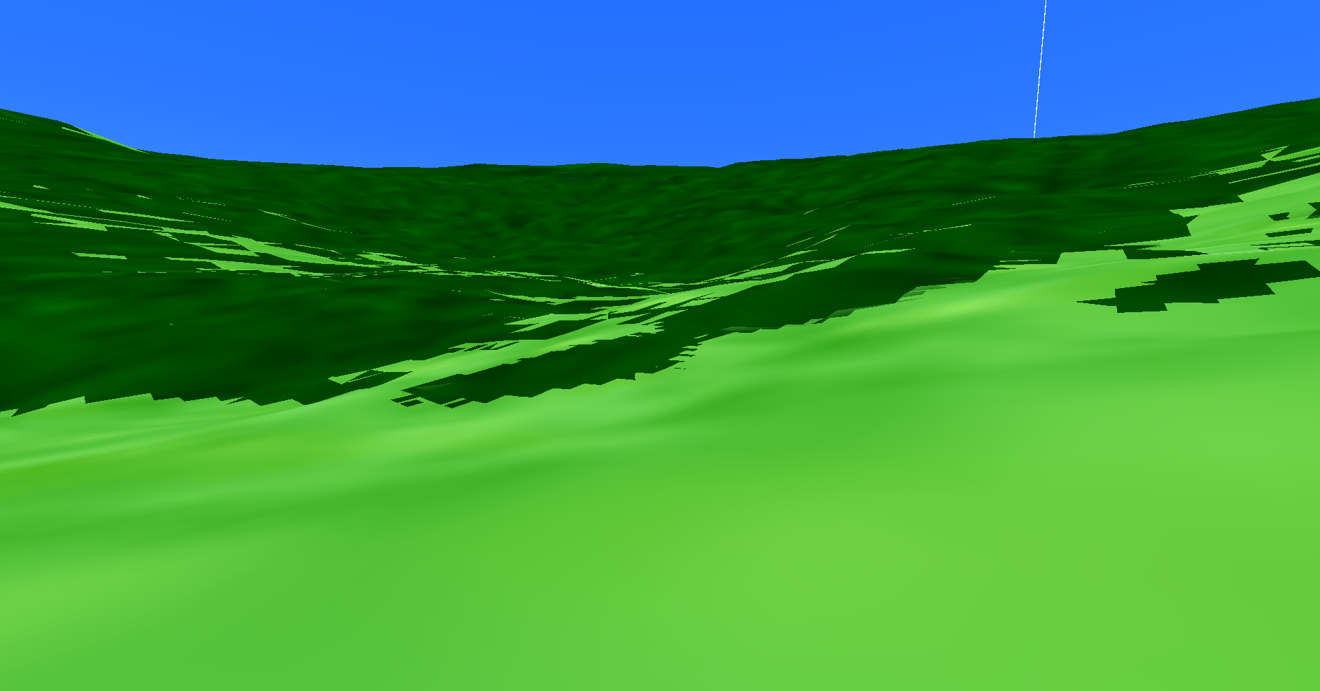
Here's an exaggerated look at the hard edges created by using normals calculated through mesh faces rather than mesh points. This screenshot also has an old color mix that I've since changed.
But this change, while much appreciated since it allows the player to actually distinguish the form of the terrain much easier, still doesn't fix the innate problem that the ground lacks texture, in an artistic sense. So, I decided to add some billboards.
This was my initial billboard test, where I just wanted to get things drawing.
Billboards, for those unaware, are sprites drawn in a 3D environment that always face the camera. Old FPS games used them to represent a bunch of things, from simple objects to enemies. Most modern games and engines use them for particles, which is kind of how I'm using them here. They're great for small objects especially, since you can't typically distinguish a thin 3D object from a 2D plane at a certain scale, and of course they're easier for the graphics card to render.
After fixing that weird horizontal line issue you see in the video, grounding all of the particles, and redoing the sprite, I eventually came up with this little demo:
I'll be honest, when I first landed on this, I thought it looked quite good. But it broke some of those rules I set at the beginning of this devlog. The terrain went from not looking detailed enough, to looking far too detailed. This might sound a little stupid, it is just the same sprite being drawn with different colors after all, but look at a single frame in this video and imagine painting it with watercolor. All of the thin, branching lines overlapping - it would probably be a nightmare.
I'm not trying to be too stingy here, but I'd like to at least make an honest effort in achieving something close to that art style. So, I started experimenting.
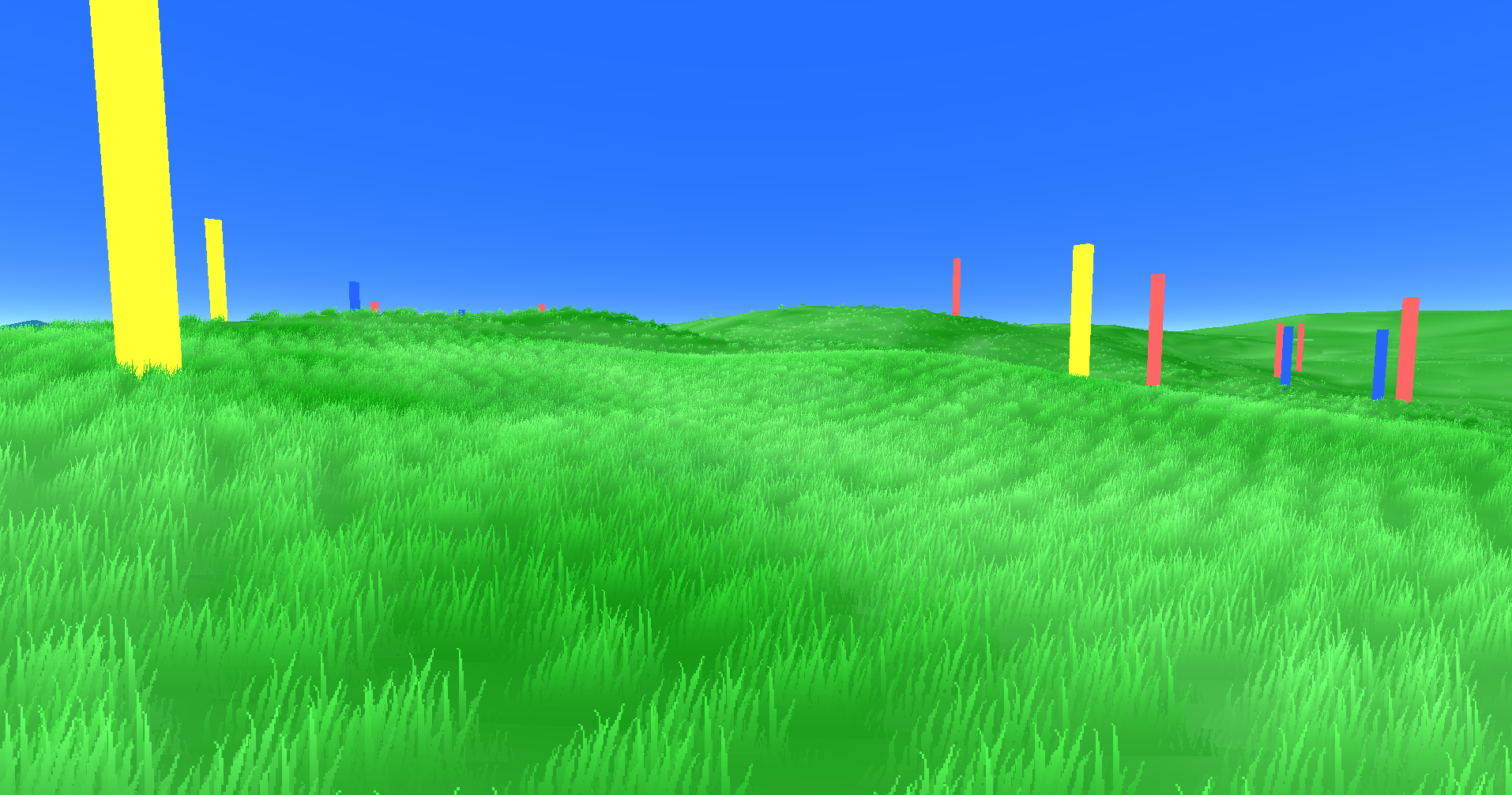
I added a gradient to see what it would look like. It didn't look too bad, honestly, but now this is breaking the watercolor rules even moreso than before, so a different approach was needed.
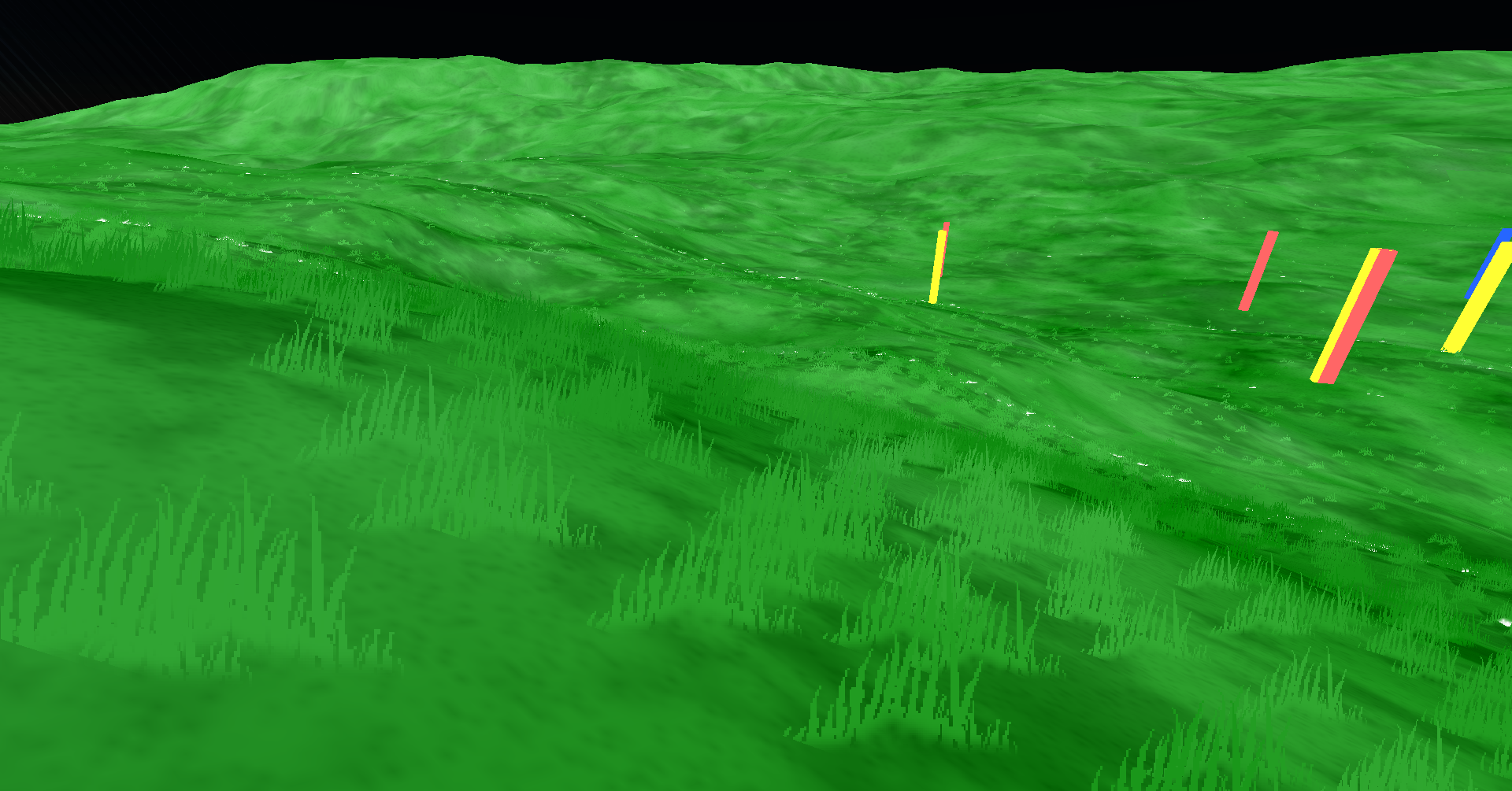
I began to realize at this point that the grass sprite wasn't going to cut it - the blades looked too tall and too separate from one another. There are some things introduced in this screenshot that I ended up keeping, however. For one, the terrain now has a texture applied to it to give it more... well... texture. The "grains" texture as I've called it would be updated a few more times throughout the development process. There's also still a gradient on the sprite, although now it's an alpha (transparency) gradient, which I've deemed to be far more acceptable than a small color gradient since it's easier to pull something like that off with watercolor (I think).
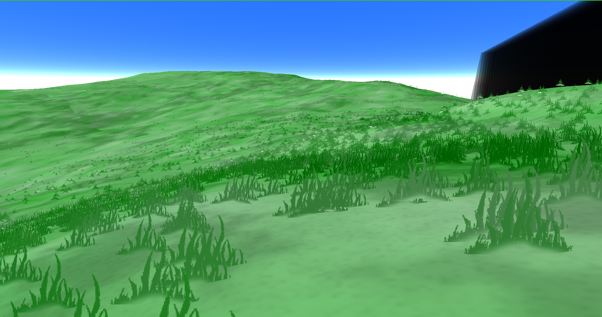
I noticed in a lot of the reference images I was looking at that the detail would often come from select dark blades of grass on top of a lighter palette. Makes sense, as with watercolor it's easy to add dark details to light objects and near impossible to add light details to dark objects. Regardless, this grass still needs a good trim. This screenshot in particular reminds me of Daggerfall.
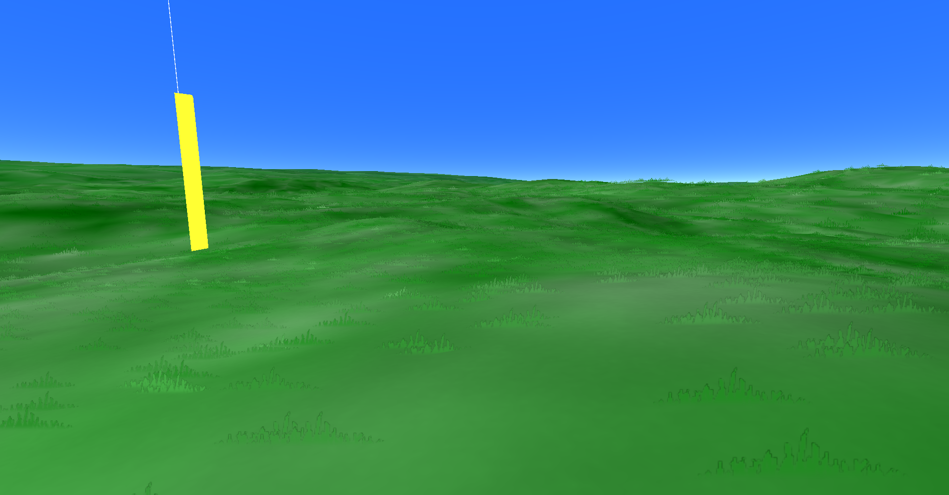
And now we've finally arrived at something pretty close to the final product - well, final for v0.1.3.
The grass is now much shorter, and the shape of it a bit blobbier to fit with the aesthetic. Note the darkened edges around the grass - this comes from the texture interpolation I'm using, but it's also a bit of a happy accident since it almost looks like some soft pencil lines around the grass, which is common in quite a bit of watercolor art that I've seen.
I spent a few days tweaking and messing with the colors, sprites, etc. The grains texture in particular was difficult for me to get right, and I'm still not quite convinced it's what I want, but it is hard to notice now (except when it's gone), so I think that's a good thing?
I think I made the grass sprites appear darker before 0.1.3's release, judging by the video.
Despite the emptiness of the game currently, there are still a few things that don't really fit the current art style, and it'll probably be a while before I get around to fixing those things. The main issue in this regard is the sky, which is just a single, flat color with no texturing whatsoever. When I get around to drawing more things in the sky, like clouds, then that'll probably be the time when I investigate what the best course of action is there.
The wall and beacon also don't fit amazingly well, but those are currently drawn using placeholder sprites anyways, so I don't really care all that much.
This devlog should've given you a good idea as to what I'm considering when thinking about the watercolor art style for this game. This was probably the most fun one yet, at least to type. If you have any ideas or suggestions on how to improve what's currently here, feel free to share them.
v0.1.4 is on the way, and I'm going to try to push it out either tomorrow or Wednesday. It's not a very exciting update, but it's an important one that helps prepare for some features coming in v0.1.5, which may be the last update in the 0.1 line. But that update will be discussed more in the next devlog. Until then, thanks for reading!
- 0de
Get Beaconfall
Beaconfall
Existential running simulator.
More posts
- v0.1.8 released.Jan 06, 2024
- v0.1.7 released.Dec 31, 2023
- v0.1.6 released.Dec 26, 2023
- #007 - It's Not Coming Out TodayDec 24, 2023
- #006 - Tree TimeDec 13, 2023
- v0.1.5 released.Dec 05, 2023
- v0.1.4 releasedNov 29, 2023
- #004 - Everything Is Made of IceNov 20, 2023
Leave a comment
Log in with itch.io to leave a comment.